

How to hang a picture properly?
A simple guide without headaches
An empty wall often raises more questions than answers: what size? at what height? one or more? If you’ve ever faced this problem, you’re not alone. The good news is: there are a few clear rules that will help you hang pictures confidently and beautifully. Let’s go step by step.
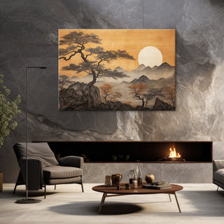
Mission Possible: How to choose the right painting size? 🖼 Have you ever felt hopeless trying to choose the perfect painting size for your home wall? A painting should not only become an important interior accent, but also blend harmoniously with the space.
1) First things first – size and proportions (a little formula that always works)
- Rule 2/3–3/4. The painting (or composition) should occupy ~ 66–75% of the area of the wall being decorated or the width of the furniture above which it hangs. For example, a sofa 210 cm → width of the painting/composition 140–160 cm.
- "Breathing" zones. Leave at least 10-15 cm from the outer edges of the wall so that the image does not "stick" to the corners.
2) Eye level – a height that creates comfort
- Gallery standard: center of painting ~ 145–152 cm from the floor.
- Above furniture: leave a 15-25 cm gap from the top of the furniture to the bottom of the painting.
-
Exceptions:
- In a children's room - children are more comfortable at eye level of 120–130 cm .
- On a staircase – follow the line of the stairs and keep the center height from the steps the same .
3) One highlight or gallery?
Quick composition recipes:
- Solo accent. One larger work, bold scale. Perfect above a sofa or bed.
- Gallery grid. 4-9 frames in even rows. Keep even spacing – 5-8 cm .
- Salon (free-flowing). A variety of formats with a clear "center" of work. Maintain a common top or bottom line to create a sense of order.
4) Unity and rhythm – so that the whole wall “sounds”
- Color harmony. Choose 2-3 colors from the interior (textiles, carpet, curtains) and let them repeat in the art or frames.
- Frames and trims. Frames of the same shade "tie" different motifs together; the trim adds air and highlights the image.
- Visual mass. If the motif is calm, it can hang alone. If it is bright, balance it with a second, quieter work nearby.
5) Where to hang in different spaces?
- Living room: one large accent above the sofa or gallery with 5-8 cm gaps.
- Bedroom: calm motifs above the headboard, composition width 70–85% of the bed width.
- Dining room: hang so that it can be seen when sitting (eye level when sitting ~ 120 cm ).
- Corridor/hallway: In narrow spaces, choose a taller, narrower format to visually "lift" the space.
- Stairs: An arrangement that rises parallel to the railing – looks neat and dynamic.
- Children's room: hang at children's eye level , choose lighter frames, and secure mountings.
6) Stress-free fastening (and without unnecessary holes)
- Paper templates. Cut out shapes the size of paintings, attach them with tape, look at them from a distance - you'll instantly see if everything is in place.
- Leveling. Use a spirit level (or a phone app).
-
Wall type:
- Drywall: choose special anchors.
- Masonry/concrete: plug-in plugs where necessary.
- Rental housing: adhesive tape/tape hooks are a great temporary solution (check weight limits).
- Two hooks > one. For large jobs, two attachment points ensure horizontality and stability.
- Soft "cushions" in the corners. Prevents slipping and protects the wall.
7) Light – the “fourth frame”
- General + accent. Soft general lighting and directional lights (or track lights) for the piece.
- Avoid direct sunlight. It fades colors; if there is a window nearby, curtains or blinds help.
- Glass in frames. Where there are a lot of reflections, choose anti-reflective .
8) Quick plan in 15 minutes
- Measure the wall and ( if any ) the furniture.
- Choose a scale of 2/3–3/4 width.
- Set the center at 145–152 cm .
- Lay out the paper templates and check for gaps of 5–8 cm.
- Mark the mounting points, check with a spirit level.
- Hang on. Step back 3-4 steps and adjust if necessary.
Common mistakes (and how to avoid them)
- The work is too small for a large wall. Enlarge the format or create a gallery .
- It's hung too high. Lower it to eye level and the space will instantly feel cozier.
- Chaotic spacing. Keep it consistent at 5–8 cm .
- A mix of frames. For consistency, choose frames of the same color or a uniform color for the frame.
- Ignore the furniture below. A distance of 15–25 cm from the top of the furniture is the golden rule.
European interior trends for 2025 that will help you decide
- Large-format canvases (one bold accent) – especially in modern and Scandinavian interiors.
- Asymmetric galleries with "air" zones - fewer but larger works.
- Black, natural wood or champagne-toned frames – effortless order and elegance.
- Textures and warm neutral palettes – canvases, rugs, linen details.
- Picture ledges and "propping" art on consoles - it's easy to change the mood without drilling.
A little reminder before hanging
- ☐ I measured the wall/furniture
- ☐ I chose 2/3–3/4 scale
- ☐ I set the center at 145–152 cm
- ☐ I planned for 5–8 cm spacings
- ☐ I checked the wall type and fixings
- ☐ I viewed the composition from a distance and while sitting (if dining room)
- ☐ I thought about lighting
Finally
A painting is not just a beautiful image. It is a mood , a story and a rhythm that connects the entire space. If you are in doubt about the size or arrangement – trust these rules and boldly experiment . And if you want even more ideas, take a look at our world of painting collections – from single-part canvases to triptychs and gallery sets. At GERA NAMIE you will find over 2000 options and, if necessary, write to us – we will advise you from the heart .